 so structurally, it's as poor as most of his recent work, but it's the failings elsewhere which make me wonder why this series is so venerated. Is it really the ultraviolence and swearing which turns on the fans? If so, then perhaps Millar is making a far better point with this comic than I give him credit for; there's nothing here that you haven't seen in umpteen other superhero comics, but the addition of heaps of gore and swearing, and the occasional breast, have made this somehow more special. I suppose that there's a possibility that this is the point of the story, and that Millar is pre-emptively poking fun at the very fans who would gravitate towards the comic for those reasons, an extension perhaps of that infamous last page of Wanted. Given Millar's usual blundering approach to the fine art of making a point, however, I doubt it.
When Marvel announced their MAX imprint, there was much speculation about whether we'd just see superhero comics full of gratuitous violence, swearing and nudity, and we did see a bit of that, but not as much as expected. That is what we get in Kick-Ass, alas; I'm no prude, but the key difference is that MAX had people like Garth Ennis, who can do gratuitous, but is a good enough writer to also give everything some kind of meaning. Ennis can do this in his sleep; think of how messy, profane and violent Preacher was, and how we laughed at Arseface, or Starr getting his bits chewed off by a dog, but then remember how satisfying the plot was, and how touching the relationships were. The closest Millar gets to that is in the relationship between the protagonist and his father, but there's too little of it to make much impact. There's also a scene in the middle somewhere, concerning a house fire, where Millar almost touches on a bit of significant character development for the Red Mist supporting character, and then squanders it completely.
(This reminds me that I need to get out my Preacher books and reread the lot. In fact, everyone should read them. Not my copies. Get your own.)
I expected such weakness from Millar, but what properly disappointed me was the absence of the much-vaunted realism. One of the selling points was that this was a superhero comic without superheroes, that it was about a normal guy dressing up in a costume and trying to fight real crime, with real consequences, and there is potential in that idea. There is some of that in the first couple of chapters, but then we get the silly Hollywood gangsters, and the whole thing gets torpedoed when
so structurally, it's as poor as most of his recent work, but it's the failings elsewhere which make me wonder why this series is so venerated. Is it really the ultraviolence and swearing which turns on the fans? If so, then perhaps Millar is making a far better point with this comic than I give him credit for; there's nothing here that you haven't seen in umpteen other superhero comics, but the addition of heaps of gore and swearing, and the occasional breast, have made this somehow more special. I suppose that there's a possibility that this is the point of the story, and that Millar is pre-emptively poking fun at the very fans who would gravitate towards the comic for those reasons, an extension perhaps of that infamous last page of Wanted. Given Millar's usual blundering approach to the fine art of making a point, however, I doubt it.
When Marvel announced their MAX imprint, there was much speculation about whether we'd just see superhero comics full of gratuitous violence, swearing and nudity, and we did see a bit of that, but not as much as expected. That is what we get in Kick-Ass, alas; I'm no prude, but the key difference is that MAX had people like Garth Ennis, who can do gratuitous, but is a good enough writer to also give everything some kind of meaning. Ennis can do this in his sleep; think of how messy, profane and violent Preacher was, and how we laughed at Arseface, or Starr getting his bits chewed off by a dog, but then remember how satisfying the plot was, and how touching the relationships were. The closest Millar gets to that is in the relationship between the protagonist and his father, but there's too little of it to make much impact. There's also a scene in the middle somewhere, concerning a house fire, where Millar almost touches on a bit of significant character development for the Red Mist supporting character, and then squanders it completely.
(This reminds me that I need to get out my Preacher books and reread the lot. In fact, everyone should read them. Not my copies. Get your own.)
I expected such weakness from Millar, but what properly disappointed me was the absence of the much-vaunted realism. One of the selling points was that this was a superhero comic without superheroes, that it was about a normal guy dressing up in a costume and trying to fight real crime, with real consequences, and there is potential in that idea. There is some of that in the first couple of chapters, but then we get the silly Hollywood gangsters, and the whole thing gets torpedoed when Tuesday, March 30, 2010
A Kick-Ass Review in Two Parts, Part the First
Mark Millar doesn't do subtlety. It's one of his recurring problems, which is why he's better on big silly stuff like that brilliant twelve-part Wolverine story he did with John Romita Jr. So you'd think that something with a name like Kick-Ass would be right up his alley; however, like his Civil War, here he attempts to merge the big stupid stuff with proper writing like what grown-ups do, and ends up with a confused mess.
This isn't about the film; I'm seeing that tomorrow, but the reviews have been positive enough that I thought about having another look at the source material. I'd avoided it the first time around because Millar's writing was becoming less and less to my tastes, too predictable and reliant on shock moments; there's a definite rhythm to his work, with every issue ending on a full-page splash, and everything else relegated to connecting matter, just bubbling along from one dramatic moment to another (I can't call them cliffhangers, because there's no tension; they're more like a musical crescendo, except without the quality implied in using foreign words). At least with the Accursed Bendis, you can't predict where the splash pages are going to be, so they often do come as a surprise change of pace from the endless pages of meaningless dialogue, but with Millar, it's like clockwork. I don't recall it being quite so bad on The Authority, so the habit must have developed sometime during his run on The Ultimates.
Anyway, that's all present and correct in Kick-Ass,  so structurally, it's as poor as most of his recent work, but it's the failings elsewhere which make me wonder why this series is so venerated. Is it really the ultraviolence and swearing which turns on the fans? If so, then perhaps Millar is making a far better point with this comic than I give him credit for; there's nothing here that you haven't seen in umpteen other superhero comics, but the addition of heaps of gore and swearing, and the occasional breast, have made this somehow more special. I suppose that there's a possibility that this is the point of the story, and that Millar is pre-emptively poking fun at the very fans who would gravitate towards the comic for those reasons, an extension perhaps of that infamous last page of Wanted. Given Millar's usual blundering approach to the fine art of making a point, however, I doubt it.
When Marvel announced their MAX imprint, there was much speculation about whether we'd just see superhero comics full of gratuitous violence, swearing and nudity, and we did see a bit of that, but not as much as expected. That is what we get in Kick-Ass, alas; I'm no prude, but the key difference is that MAX had people like Garth Ennis, who can do gratuitous, but is a good enough writer to also give everything some kind of meaning. Ennis can do this in his sleep; think of how messy, profane and violent Preacher was, and how we laughed at Arseface, or Starr getting his bits chewed off by a dog, but then remember how satisfying the plot was, and how touching the relationships were. The closest Millar gets to that is in the relationship between the protagonist and his father, but there's too little of it to make much impact. There's also a scene in the middle somewhere, concerning a house fire, where Millar almost touches on a bit of significant character development for the Red Mist supporting character, and then squanders it completely.
(This reminds me that I need to get out my Preacher books and reread the lot. In fact, everyone should read them. Not my copies. Get your own.)
I expected such weakness from Millar, but what properly disappointed me was the absence of the much-vaunted realism. One of the selling points was that this was a superhero comic without superheroes, that it was about a normal guy dressing up in a costume and trying to fight real crime, with real consequences, and there is potential in that idea. There is some of that in the first couple of chapters, but then we get the silly Hollywood gangsters, and the whole thing gets torpedoed when
so structurally, it's as poor as most of his recent work, but it's the failings elsewhere which make me wonder why this series is so venerated. Is it really the ultraviolence and swearing which turns on the fans? If so, then perhaps Millar is making a far better point with this comic than I give him credit for; there's nothing here that you haven't seen in umpteen other superhero comics, but the addition of heaps of gore and swearing, and the occasional breast, have made this somehow more special. I suppose that there's a possibility that this is the point of the story, and that Millar is pre-emptively poking fun at the very fans who would gravitate towards the comic for those reasons, an extension perhaps of that infamous last page of Wanted. Given Millar's usual blundering approach to the fine art of making a point, however, I doubt it.
When Marvel announced their MAX imprint, there was much speculation about whether we'd just see superhero comics full of gratuitous violence, swearing and nudity, and we did see a bit of that, but not as much as expected. That is what we get in Kick-Ass, alas; I'm no prude, but the key difference is that MAX had people like Garth Ennis, who can do gratuitous, but is a good enough writer to also give everything some kind of meaning. Ennis can do this in his sleep; think of how messy, profane and violent Preacher was, and how we laughed at Arseface, or Starr getting his bits chewed off by a dog, but then remember how satisfying the plot was, and how touching the relationships were. The closest Millar gets to that is in the relationship between the protagonist and his father, but there's too little of it to make much impact. There's also a scene in the middle somewhere, concerning a house fire, where Millar almost touches on a bit of significant character development for the Red Mist supporting character, and then squanders it completely.
(This reminds me that I need to get out my Preacher books and reread the lot. In fact, everyone should read them. Not my copies. Get your own.)
I expected such weakness from Millar, but what properly disappointed me was the absence of the much-vaunted realism. One of the selling points was that this was a superhero comic without superheroes, that it was about a normal guy dressing up in a costume and trying to fight real crime, with real consequences, and there is potential in that idea. There is some of that in the first couple of chapters, but then we get the silly Hollywood gangsters, and the whole thing gets torpedoed when deadly little Miho Hit-Girl turns up, all ninja swords and precise-to-the-nearest-molecule decapitations. If you're going to throw in a fantasy element, why not just go the whole hog and give her superpowers? Again, it's a sign of Millar's lack of discipline as a writer, an inability to step back and see if what he's created actually works. This is, of course, what editors are for, but Marvel's editors have been somewhat lax for years now. Oddly enough, the ending doesn't rankle in the same way; it's the same idea of the self-fulfilling prophecy we saw in Unbreakable (still Shyamalan's only good film, and a good example of how to make the "mundande superhero" concept work), and it makes much more sense than Hit-Girl.
John Romita Junior is about the only redeeming feature of the book, again turning in excellent artwork. One could argue that given the "realistic" concept, a more photo-referenced art style may have been a better choice, but there's always been something very "normal" about the way Romita draws the world, a visual consistency which gives the whole thing a verisimilitude which an artist like Alex Ross or (argh) Greg Land would struggle in vain to produce. So I'm pleased for him that the project has been such a success, as it seems to have translated to the kind of high-profile jobs over at Marvel proper which he should have been doing all along (he's the artist on the upcoming Avengers title, which is written by the Accursed Bendis, so I'll be giving it a miss, but I was this close).
Anyway, so there you go. Kick-Ass doesn't. As I mentioned above, the film has been getting decent reviews, so we'll see how it compares.
so structurally, it's as poor as most of his recent work, but it's the failings elsewhere which make me wonder why this series is so venerated. Is it really the ultraviolence and swearing which turns on the fans? If so, then perhaps Millar is making a far better point with this comic than I give him credit for; there's nothing here that you haven't seen in umpteen other superhero comics, but the addition of heaps of gore and swearing, and the occasional breast, have made this somehow more special. I suppose that there's a possibility that this is the point of the story, and that Millar is pre-emptively poking fun at the very fans who would gravitate towards the comic for those reasons, an extension perhaps of that infamous last page of Wanted. Given Millar's usual blundering approach to the fine art of making a point, however, I doubt it.
When Marvel announced their MAX imprint, there was much speculation about whether we'd just see superhero comics full of gratuitous violence, swearing and nudity, and we did see a bit of that, but not as much as expected. That is what we get in Kick-Ass, alas; I'm no prude, but the key difference is that MAX had people like Garth Ennis, who can do gratuitous, but is a good enough writer to also give everything some kind of meaning. Ennis can do this in his sleep; think of how messy, profane and violent Preacher was, and how we laughed at Arseface, or Starr getting his bits chewed off by a dog, but then remember how satisfying the plot was, and how touching the relationships were. The closest Millar gets to that is in the relationship between the protagonist and his father, but there's too little of it to make much impact. There's also a scene in the middle somewhere, concerning a house fire, where Millar almost touches on a bit of significant character development for the Red Mist supporting character, and then squanders it completely.
(This reminds me that I need to get out my Preacher books and reread the lot. In fact, everyone should read them. Not my copies. Get your own.)
I expected such weakness from Millar, but what properly disappointed me was the absence of the much-vaunted realism. One of the selling points was that this was a superhero comic without superheroes, that it was about a normal guy dressing up in a costume and trying to fight real crime, with real consequences, and there is potential in that idea. There is some of that in the first couple of chapters, but then we get the silly Hollywood gangsters, and the whole thing gets torpedoed when 

Wednesday, March 17, 2010
Irony?
The head of Ireland's Catholics has apologised for his role in mishandling the case of a serial child abuser.
A Catholic adoption society has won a High Court battle over laws forcing it to consider gay couples as parents.
Yeah, because they clearly are the right people to decide who can look after kids.
A Catholic adoption society has won a High Court battle over laws forcing it to consider gay couples as parents.
Yeah, because they clearly are the right people to decide who can look after kids.
Sunday, March 14, 2010
Sunday, March 07, 2010
Love Your Auntie
The BBC has been under fire of late, with the most recent example being the planned cutbacks to their internet services, along with the axing of Asian Network and 6 Music.
It's easy to moan about the BBC, about the licence fee, or about how output seems to be getting cheaper and more superficial, but I think we take the Beeb for granted. Spend some time in the US, for example, and you'll find you miss the public service output of the BBC. You'll miss the approach to news. And yes, you'll miss the lack of adverts, but what you'll also notice is the lack of corporate interference, and the subsequent honesty, in programming.
It's not perfect. There's a lot of shite on the BBC, but it's mainly the light entertainment stuff, and light entertainment is always rubbish. But then I watch things like last night's brilliant, intelligent and honest Wonders of the Solar System, and I become deathly afraid of what the predatory Rupert Murdoch, and his puppets in the incoming Tory government, have planned for this great, and it is great, institution.
It's easy to moan about the BBC, about the licence fee, or about how output seems to be getting cheaper and more superficial, but I think we take the Beeb for granted. Spend some time in the US, for example, and you'll find you miss the public service output of the BBC. You'll miss the approach to news. And yes, you'll miss the lack of adverts, but what you'll also notice is the lack of corporate interference, and the subsequent honesty, in programming.
It's not perfect. There's a lot of shite on the BBC, but it's mainly the light entertainment stuff, and light entertainment is always rubbish. But then I watch things like last night's brilliant, intelligent and honest Wonders of the Solar System, and I become deathly afraid of what the predatory Rupert Murdoch, and his puppets in the incoming Tory government, have planned for this great, and it is great, institution.
Saturday, March 06, 2010
Anyone Want These?
Action Comics #775
Amazing Spider-Man #519-524
The Authority #17
The Authority: Devil's Night
The Authority vs Lobo: Jingle Hell
Avengers v3 #24
Avengers United (UK) #6, 13, 16-18
Batman Legends (UK) #1
Binary #2,4
Birds of Prey #19
Buckaroo Banzai Preview
Captain Marvel (2000) #11, (2002) #1
The Chase #1
Civil War: Opening Shot Sketchbook
Cla$$war #1
The Coffin #1-2
Conan (Dark Horse) #0, 11-12
Crimson (TPB) v1-2
Darkstalkers #6a
Death Jr TPB
Defenders (2001) #2, 12
Dragonball #4.3
Edge (TPB) v1-7
El Arsenal: Unknown Enemy #1
Essential X-Men (UK) #79-80, 84
The Establishment #1-2
Fantastic Four v3 #42-45
Flight (Free Comic Book Day preview)
Forge (TPB) v1, 3-7
Forgotten Realms: Exile #1-3 (complete set)
Forgotten Realms: Sojourn #1
Generation X #75
The Gray Area #1
Harry Johnson #1-2
Image First (first issues of various Image series, collected into one book) v1
Invincible #55
Killraven (2002) #1
Knights of Pendragon #14-16
Last Shot #2
Legion of Super Heroes (1998) #102
Marville #1
Middle Man #1
Midnight Nation #8
The Monarchy #1
Motor Mayhem One Shot
My Name is Bruce One Shot
New Avengers #8-13, 31
PVP #0
Randy O'Donnell is the M@n #3
Red Sonja (Dynamite comics) #0
Revelations #2
Rising Stars #5
Runes of Ragnan #1
Scars Sampler
Seven Soldiers #0
Seven Soldiers: The Manhattan Guardian #1
Shidima #0a
Shock Rockets #1-3
Spawn: Transformation TPB (#31-36, not in good condition)
Spawn #112
Spawn: The Dark Ages #13
Spider-Man: Marvel Knights #1
Star Wars Tales FCBD One Shot
Strange Girl #4
Thundercats (2002) #1
Transmetropolitan #32
Truth: Red, White and Black #1 (water damaged, but perfectly readable)
Ultimate Adventures #1
Ultimate Marvel Team-Up #11
Ultimates #1
Ultimates 2 #4
Ultimate X-Men (FCBD) #1
Uncanny X-Men #228
Vertigo Pop! London #1
Warlands #3
Way of the Rat (FCBD) #1
Wildcats v3.0 #19
Wildstorm Summer Special
X-Force #110-115
XIII #1
X-Men #166
X-Men: The Movie #1
X-Treme X-Men #1-3
Ultimate Nightmare #1-5 (complete set)
Unless otherwise noted, these are all in pretty good condition, having only been read once or twice. I'm mainly interested in getting rid of them, so if you want to pay, you can, but I do ask for you to cover postage at least, which may be expensive if you want lots of them and live in a far away land.
Amazing Spider-Man #519-524
The Authority #17
The Authority: Devil's Night
The Authority vs Lobo: Jingle Hell
Avengers v3 #24
Avengers United (UK) #6, 13, 16-18
Batman Legends (UK) #1
Binary #2,4
Birds of Prey #19
Buckaroo Banzai Preview
Captain Marvel (2000) #11, (2002) #1
The Chase #1
Civil War: Opening Shot Sketchbook
Cla$$war #1
The Coffin #1-2
Conan (Dark Horse) #0, 11-12
Crimson (TPB) v1-2
Darkstalkers #6a
Death Jr TPB
Defenders (2001) #2, 12
Dragonball #4.3
Edge (TPB) v1-7
El Arsenal: Unknown Enemy #1
Essential X-Men (UK) #79-80, 84
The Establishment #1-2
Fantastic Four v3 #42-45
Flight (Free Comic Book Day preview)
Forge (TPB) v1, 3-7
Forgotten Realms: Exile #1-3 (complete set)
Forgotten Realms: Sojourn #1
Generation X #75
The Gray Area #1
Harry Johnson #1-2
Image First (first issues of various Image series, collected into one book) v1
Invincible #55
Killraven (2002) #1
Knights of Pendragon #14-16
Last Shot #2
Legion of Super Heroes (1998) #102
Marville #1
Middle Man #1
Midnight Nation #8
The Monarchy #1
Motor Mayhem One Shot
My Name is Bruce One Shot
New Avengers #8-13, 31
PVP #0
Randy O'Donnell is the M@n #3
Red Sonja (Dynamite comics) #0
Revelations #2
Rising Stars #5
Runes of Ragnan #1
Scars Sampler
Seven Soldiers #0
Seven Soldiers: The Manhattan Guardian #1
Shidima #0a
Shock Rockets #1-3
Spawn: Transformation TPB (#31-36, not in good condition)
Spawn #112
Spawn: The Dark Ages #13
Spider-Man: Marvel Knights #1
Star Wars Tales FCBD One Shot
Strange Girl #4
Thundercats (2002) #1
Transmetropolitan #32
Truth: Red, White and Black #1 (water damaged, but perfectly readable)
Ultimate Adventures #1
Ultimate Marvel Team-Up #11
Ultimates #1
Ultimates 2 #4
Ultimate X-Men (FCBD) #1
Uncanny X-Men #228
Vertigo Pop! London #1
Warlands #3
Way of the Rat (FCBD) #1
Wildcats v3.0 #19
Wildstorm Summer Special
X-Force #110-115
XIII #1
X-Men #166
X-Men: The Movie #1
X-Treme X-Men #1-3
Ultimate Nightmare #1-5 (complete set)
Unless otherwise noted, these are all in pretty good condition, having only been read once or twice. I'm mainly interested in getting rid of them, so if you want to pay, you can, but I do ask for you to cover postage at least, which may be expensive if you want lots of them and live in a far away land.
Wednesday, February 24, 2010
Monday, February 22, 2010
Top Ten Comic Costumes
I meant to do this ages ago, when Nige did it, but I forgot, and Rol has since reminded me. So here goes, again in no particular order:
10. Advanced Idea Mechanics

Hydra's goons get proper supervillain costumes. The Hand's ninjas all get pyjamas in which to go and get beaten up by Daredevil. AIM though, they get to wear, well, what they wear to work. I love that it's just their work uniform, no fuss, no frills, like they walked out of the factory and straight into a brawl with Captain America.
9. The Avengers' leather jackets

The 90's were a dark time in comics, when many very silly things happened. Superman grew a mullet, Spider-Man got a suit of armour, and the Avengers got leather jackets. Rumour has it that someone at Marvel saw that the X-Men comics were selling shedloads, and decided that it was because of the matching leather jackets they all wore, and so forced the Avengers writers to include similar outfits. Sales did not increase.
Still, ill-advised as they were, there's something charming about the Avengers team jackets. It's a neat way of creating a united team visual while still keeping the individual costumes. See also the nextwave trenchcoats and Jubilee's hipster X-Men parka, the latter of which is now in the possession of one Mr Scott Pilgrim.
8. Darwyn Cooke's Catwoman costume

Not his actual one, obviously. Not that he has one. Well, he might, I don't know what he gets up to in his spare time. Anyway... the reason I like this one is because it's a very clean design with one foot in the pulp forebears of superhero comics, and the other in a more modern style, but which retains some subtle nods to the whole feline schtick. I'm not really one for making superhero costumes more "sensible", but this is one which works.
7. Daredevil's black costume

No, not that one.

The one he wore before the hideous yellow outfit, as told in Frank Miller's Man Without Fear miniseries. It's basically a black tracksuit, complete with white trainers, but there's something devil-may-care about that, and after all, DD's blind, so what does he care what he looks like?
6. Doctor Strange

Because it's so, er, strange. There's no unifying design, the colours are all over the place, you've got that weird liver spot pattern on the gloves, the nonsensical shirt logo (is it a bird? An angel?), and the plain leggings, as if they ran out of ideas by the time they got to his waist; it's a visual mess, but because it's Steve Ditko, it's a glorious mess which somehow still works. Strange wore a trenchcoat for a while in the 90's too, but it didn't suit him.
5. Hela

Just look at the design. It's all design. It's got design dripping off it, there's so much design going on. And yet, it's actually quite a simple two-tone thing. Kirby busted out these simple geometric costumes now and then, and they're his best designs by far.
4. Iron Man

It doesn't really matter which one, as they're all great in their own way (except the dodgy Rob Liefeld Heroes Reborn one). My favourites are probably the one from the Byrne era on Avengers, and the "silver centurion" one from just after that.
3. The New Green Goblin

The Ditko design is a classic, make no mistake, but I really like Humberto Ramos' early-2000s revamp, which is actually not really much of a revamp at all, it's just drawn differently. The shirt is gone, but the green chainmail is still there, and the mask is the same, it's all just a bit better in some way I can't properly describe.
2. Robin

I suppose technically this is the Tim Drake costume, although the image is from Teen Titans Go! and it's probably Dick Grayson wearing it there. Anyway, it's a good set of colours, a clean design, and an effective contrast with his mentor's costume, something the more recent angsty versions have forgotten.
1. Spider-Man's black costume

The red and blue is a classic, and rightly so, and as Rol points out, it makes perfect sense in the context of the character's masked wrestler origins. All that said, the black costume looks great. It fits the spider theme perfectly, and for a few years in the 1980's, it made for a striking image unlike any other hero in comics. I know it's all part of the grim-and-gritty movement in the superhero genre of the time, and the costume begat a decade of rubbish symbiote stories (and Spider-Man 3), but it's a great visual.
Honourable Mentions:
I would have picked MODOK, but the iconic image there is not really a costume, more a general character design. Ditto Thor, Hellboy, Death's Head and Rocket Raccoon. I almost picked the Frank Quitely X-Men costume, but it's probably aged worse than the Avengers' jackets. Finally, the Hobgoblin would have been picked if Ramos hadn't beefed up his predecessor's look.
10. Advanced Idea Mechanics

Hydra's goons get proper supervillain costumes. The Hand's ninjas all get pyjamas in which to go and get beaten up by Daredevil. AIM though, they get to wear, well, what they wear to work. I love that it's just their work uniform, no fuss, no frills, like they walked out of the factory and straight into a brawl with Captain America.
9. The Avengers' leather jackets

The 90's were a dark time in comics, when many very silly things happened. Superman grew a mullet, Spider-Man got a suit of armour, and the Avengers got leather jackets. Rumour has it that someone at Marvel saw that the X-Men comics were selling shedloads, and decided that it was because of the matching leather jackets they all wore, and so forced the Avengers writers to include similar outfits. Sales did not increase.
Still, ill-advised as they were, there's something charming about the Avengers team jackets. It's a neat way of creating a united team visual while still keeping the individual costumes. See also the nextwave trenchcoats and Jubilee's hipster X-Men parka, the latter of which is now in the possession of one Mr Scott Pilgrim.
8. Darwyn Cooke's Catwoman costume

Not his actual one, obviously. Not that he has one. Well, he might, I don't know what he gets up to in his spare time. Anyway... the reason I like this one is because it's a very clean design with one foot in the pulp forebears of superhero comics, and the other in a more modern style, but which retains some subtle nods to the whole feline schtick. I'm not really one for making superhero costumes more "sensible", but this is one which works.
7. Daredevil's black costume

No, not that one.

The one he wore before the hideous yellow outfit, as told in Frank Miller's Man Without Fear miniseries. It's basically a black tracksuit, complete with white trainers, but there's something devil-may-care about that, and after all, DD's blind, so what does he care what he looks like?
6. Doctor Strange

Because it's so, er, strange. There's no unifying design, the colours are all over the place, you've got that weird liver spot pattern on the gloves, the nonsensical shirt logo (is it a bird? An angel?), and the plain leggings, as if they ran out of ideas by the time they got to his waist; it's a visual mess, but because it's Steve Ditko, it's a glorious mess which somehow still works. Strange wore a trenchcoat for a while in the 90's too, but it didn't suit him.
5. Hela

Just look at the design. It's all design. It's got design dripping off it, there's so much design going on. And yet, it's actually quite a simple two-tone thing. Kirby busted out these simple geometric costumes now and then, and they're his best designs by far.
4. Iron Man

It doesn't really matter which one, as they're all great in their own way (except the dodgy Rob Liefeld Heroes Reborn one). My favourites are probably the one from the Byrne era on Avengers, and the "silver centurion" one from just after that.
3. The New Green Goblin

The Ditko design is a classic, make no mistake, but I really like Humberto Ramos' early-2000s revamp, which is actually not really much of a revamp at all, it's just drawn differently. The shirt is gone, but the green chainmail is still there, and the mask is the same, it's all just a bit better in some way I can't properly describe.
2. Robin
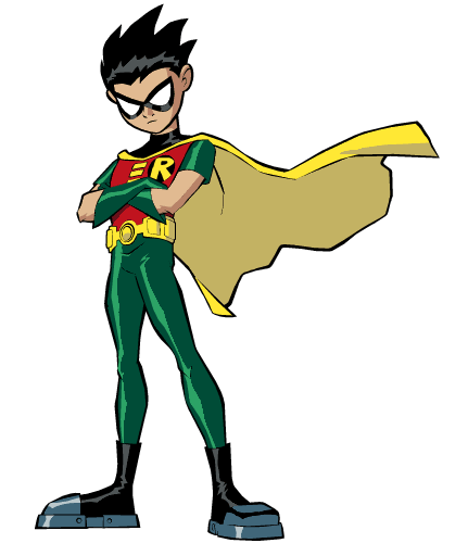
I suppose technically this is the Tim Drake costume, although the image is from Teen Titans Go! and it's probably Dick Grayson wearing it there. Anyway, it's a good set of colours, a clean design, and an effective contrast with his mentor's costume, something the more recent angsty versions have forgotten.
1. Spider-Man's black costume

The red and blue is a classic, and rightly so, and as Rol points out, it makes perfect sense in the context of the character's masked wrestler origins. All that said, the black costume looks great. It fits the spider theme perfectly, and for a few years in the 1980's, it made for a striking image unlike any other hero in comics. I know it's all part of the grim-and-gritty movement in the superhero genre of the time, and the costume begat a decade of rubbish symbiote stories (and Spider-Man 3), but it's a great visual.
Honourable Mentions:
I would have picked MODOK, but the iconic image there is not really a costume, more a general character design. Ditto Thor, Hellboy, Death's Head and Rocket Raccoon. I almost picked the Frank Quitely X-Men costume, but it's probably aged worse than the Avengers' jackets. Finally, the Hobgoblin would have been picked if Ramos hadn't beefed up his predecessor's look.
Friday, February 19, 2010
Team B
I have said that this new A-Team film looks a bit like kids playing dress-up, a sort of grown-up version of Son of Rambow. Or perhaps this:
I'm not sure I can tell the difference.
I'm not sure I can tell the difference.
Monday, February 15, 2010
My Town
I don't tend to do music posts. I'm not an erudite musichead like Rol; I discovered The Smiths twenty years after the fact, as a particularly embarrassing example. I tend to like stuff no one else does (but not Country, because even I'm not that out of touch), so I don't really feel like I have much to blog about music.
My mate Bob knows a fair bit though, and he's in a band and everything. They've just released a single, which you can buy on iTunes, Amazon, and Napster, apparently, although I had no idea Napster was still going. I quite like it (the song, not Napster), although I think there are better tracks on the upcoming album, and one stonking song that the Reverence haven't recorded for some unfathomable reason, perhaps so that they can release Japanese-exclusive bootleg live albums later on.
Anyway, you can see the video for the song at the band's website, and if you like the song, it's only seventy-nine of your English pence.
It's not Country.
My mate Bob knows a fair bit though, and he's in a band and everything. They've just released a single, which you can buy on iTunes, Amazon, and Napster, apparently, although I had no idea Napster was still going. I quite like it (the song, not Napster), although I think there are better tracks on the upcoming album, and one stonking song that the Reverence haven't recorded for some unfathomable reason, perhaps so that they can release Japanese-exclusive bootleg live albums later on.
Anyway, you can see the video for the song at the band's website, and if you like the song, it's only seventy-nine of your English pence.
It's not Country.
Monday, January 11, 2010
I Pity the Fool
I think the thing which sinks it is Neeson's hair. If they'd cast someone with white hair, it would have been fine, but to dye his white just makes it look like a fan film. There's some suggestion here that it's a disguise, but still.
For some fun, let's see what kind of "A-Team" related puns we can come up with in the comments, before the film comes out, and all the presumably negative reviews are full of them.
Subscribe to:
Posts (Atom)