Showing posts with label I review comics. Show all posts

Saturday, August 16, 2025

My Dirty Secret (Defenders)


Calvin, I did not resist the temptation.


I even read it! The most surprising thing is that it's not terrible. It's not good either, but by the standards of 1990's Marvel it could be much, much worse. Both writing and art are solid but unimpressive. The storytelling is clear but never dramatic. It's competent, if dull. That said, there's a halfway interesting central mystery.

There are a couple of clumsy, weird moments, like Spider-Woman almost fumbling an investigation just so Wolverine can tell her off in the next panel, or whatever the creative decision was behind this panel:


After some arbitrary fighting with random costumed villains, the issue ends with the introduction of a new character! We don't know if they are hero or villain, which I think was probably the intent. I hope.


(It's impossible for any of these characters to be standing where they are based on their positions in the previous panel, by the way.)

I don't have #2 so I don't know why this character is called Dreadlox, but I'm hoping it's something to do with liquid oxygen related powers. I did look the character up to see if they had appeared again, as they are just the sort of obscure rando who would get used in an Al Ewing or Jed McKay comic, but alas they only seemed to appear in this one storyline.

Anyway, that's Secret Defenders #1. Not terrible, not good either. I give it two Cables out of five.

Wednesday, May 21, 2025

4000ad

I've been looking through my 2000ad collection* and I thought I'd highlight this one: Prog 2000, released in December 1999 as a double celebration; a big end-of-year special, and a semi-surprised "Crikey!" that 2000ad lasted up to, well, 2000AD, when pretty much every other British comic -- aside from stuff like The Beano or Commando that will likely survive the heat death of the universe -- had folded years before.

This is more properly Prog 1173.5 -- the "real" Prog 2000 would come in 2016 -- but given the date of publication, I can understand why they would jump the gun. This started** a tradition of big end-of-year specials that were numbered by year until 2016 when they switched to the weekly numbering, so there were also two 2001s, two 2002s, and so on.

Still with me?

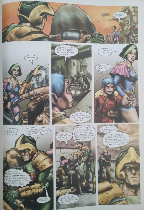
I don't get many of the weekly issues these days but I always pick up the big end-of-year specials, and I think this first one is one of the best. As a look back at the glory days of the comic, they managed to bring back some big name artists who had long before departed for the US comics industry. There's a cover from Brian Bolland -- who apparently "enthusiastically agreed" -- Dave Gibbons coming back to draw a Rogue Trooper -- sort of -- story, Kevin O'Neill returning for the final episode of the batshit insane Nemesis the Warlock, and Mike McMahon and Cam Kennedy on the two Judge Dredd stories.

Aside from the "old" superstars, you've got incredible detailed black and white art from Kev Walker on ABC Warriors, the underrated Simon Fraser on Nikolai Dante, the genius Carlos Ezquerra on Strontium Dog, glorious painting from Greg Staples on Sláine and Simon Davis on Sinister Dexter, and Mark Harrison's impossible*** paint/digital hybrid art on Glimmer Rats.

Not every story is good, as such, but it all looks amazing, and is probably the most consistently good-looking of the specials.

Here, have a look:

Mike McMahon:
Dave Gibbons:
Kev Walker. Good gosh, look at it:
Simon Fraser. Most of this story is a sex scene, and I try to keep this blog relatively family friendly, so you get crying in the rain instead:
Carlos Ezquerra, experimenting with some slightly dodgy 1999 computer effects:
Greg Staples. This is a weekly comic, remember:
Simon Davis, ditto:
Kevin O'Neill, the only person to have his entire art style banned by DC Comics. Their loss:
Mark Harrison, the same one who drew "The Travellers" in White Dwarf, engaging in some sort of sorcery:
Cam Kennedy:

Not bad for £3.95 Earth money!

*(It's not much of a collection; a few issues from when I was reading the weekly comic, and every end-of-year special since 2000.)

**(There had been the traditional British Christmas annuals -- different to US comic annuals -- but those stopped in the 1990s... except they did an annual in 2025, in addition to the special, just to confuse matters.)

***(I can't work out how he did it in 1999, anyway.)

Tuesday, February 07, 2023

Cradlegrave

Well, it can't all be Dungeon23 content!

I got this book for Chrimble and have been thinking about it ever since. I think I'm ready to put those thoughts down in words. Maybe. Ish.

Published over 11 weeks in sci-fi-mostly anthology comic 2000AD in 2009, Cradlegrave looks very much like an entry in the "Hoodie Horror" genre, and it sort of is, but the cover is a bit misleading. I'll go into more spoilery discussion below, but if you want a brief non-spoilerific review: it's an effective and interesting modern(ish) horror story, with clever writing and excellent art, and it is much recommended.

And now, the meaty bits...

Aside; Hoodie Horror: Former Prime Minister and pig-botherer in chief David Cameron appealed to the middle-classes with his vision of "Broken Britain" in which THE POOR -- gasp! -- were waiting, with hoods and knives, to rape, stab, and steal from good honest hard working Britons and, of course, only a Conservative government could prevent this, mainly by freezing or starving the poor to death, a shameful policy that continues to this day.

This vision spawned a brief mini genre of horror film in which hooded youths became the faceless monsters in the dark, lurking on their estates, ready to pounce. These films were sometimes supernatural, more often not, but were almost always conservative in tone, disgusted and horrified by Britain's "underclass". Eden Lake (2008) is perhaps the most famous example, Harry Brown (2009) the most offensive, and Attack the Block (2011) is a notable inversion or retort, to which we will return.

For more on the genre, there are excellent brief introductions here and here.


So, Cradlegrave then. What we have here is a horror story set on a housing estate somewhere in sunny Lancashire. Ravenglade is the official name, but the locals call it "Cradlegrave" because no one ever escapes; you are born there, you live there, and you die there. Social mobility is a myth told by the rich. Our protagonist, Shane, returns from a stint in a Young Offender Institution intent on making a fresh start and not falling into old habits with old friends, only to find that there is something rotten at the heart of the estate. Something alien.

"Lovecraftian" is the obvious description, and it is superficially so, with a horrible gribbly thing spurting out "black milk" like Shub-Niggurath itself, and even a nascent cult forming around the creature, but I suspect old Howard would have recoiled from the portrayal of the youths as misunderstood rather than irredeemable scum. Like Attack the Block -- I said we'd return -- Shane and his friends are petty criminals who drink and smoke and take drugs, but -- crucially -- that doesn't make them bad people. Their lifestyle is very much presented as a response to the deprivation of their surroundings, almost an adaptation to things they cannot themselves control. There is no judgement; this is all bad, but it's the way it is, and it's not always their fault.

In fact, the real horror turns out to be the nice old couple down the road, Ted and Mary, who just wish for things to go back to the way they were in happier times, before the estate -- and, one suspects, the people -- sprang up around them. Literal "old ones", but perhaps not in the way Lovecraft would have intended. Mary is, or has been physically co-opted by, some sort of entity and begins corrupting the estate; Ted helps her at first, but when it becomes clear that the thing in the bedroom is no longer his wife, escapes in the only way he can. As the corruption spreads and what little social order there is breaks down, it is up to Shane to take action, which he does through a firebomb, reprising the crime that put him in prison in the first place.

It's a bleak, dark story. Edmund Bagwell's art is both mundane at depicting the realities of life on the estate and gruesome when presenting the alien body horror of Mary's transformation and how she, um, "interacts" with the locals. There is little sense of hope. You get the feeling that the estate falls under Mary's sway as much because it's something to do as any overt alien influence. Shane escapes and leaves the horror behind, but while he perhaps "wins", it's clear that not only does the horror continue in his absence, but his fresh start was a, um, non-starter. And of course the larger social issues remain unresolved; you can lob a Molotov at a monster, but you can't burn down decades of deprivation and lack of social support, you can't burn down a class system that is stacked against the poorest and most vulnerable.

(Unless you're French, probably.)

The only way to win is to burn everything down and run away. That's bare bleak, bruv.

Cradlegrave is a greasy, prickly, unpleasant little horror story, and I mean all of that as a compliment. It's deep and fascinating and I wish it was more well known. While Hoodie Horror is perhaps of its time, I think Cradlegrave still has things to say -- alas the poor are still demonised under the Tories -- and is still effective and relevant, like all the best horror stories.

Tuesday, September 21, 2021

Incoherent Peacekeeping Agent

Right, so "Clone Drive" then.

I read this story when it came out as individual issues of Death's Head v2 in 2019 and it didn't make much sense then. I got the collected edition as a birthday present a few days ago and gave it another go, to see if a second try and a couple of years made a difference. Alas, it has not.

The main problem is a chronic lack of coherence. Despite being published as Death's Head v2, I think it's supposed to be the origin of a new version of the character -- Death's Head V, or "Vee" -- except he gets very little screen time and achieves almost nothing. So maybe it is about the original DH after all? It does start and end with him, but then he gets pushed aside by half of the Young Avengers, also achieves very little except to get a new sidekick, then disappears with her off to deep space where undoubtedly we will see neither of them again.

We don't get enough of Vee to make him compelling enough to follow, not that we can follow him because he hasn't appeared since as far as I can tell. If it's about reintroducing Death's Head to the Marvel Universe, sticking him in deep space is an odd way of doing it. If it's a celebration of the character -- which is what artist Kei Zama suggested when it was first published -- sidelining the ostensible star is an odd way to do it.There's no room for anything to breathe, and it all feels muddled.

Then there's the nonsense. We start with Death's Head falling through a space portal into a bin in New York, which is apparently enough to deactivate and dissasemble him. Then he is somehow turned into an amplifier for a punk band. I don't know how this works. Wiccan and Hulkling run into him by accident, except it's not by accident because Wiccan did some magic that brought them there. I think? Maybe? Wiccan did this because he already has a DH -- Vee -- under his bed and wants to know what it is. Probably? Wiccan has Vee under his bed because he did some magic to see possible futures for the Young Avengers and saw Vee in some of them, and then went on an untold solo adventure to an AIM laboratory and stole Vee. I think? But it turns out that the whole thing was some sort of elaborate plan by the villain to get her hands on the original DH for... reasons. Except the villain turns out to just want to hang with DH so they go off together and leave everyone else behind. It's possible that the villain just changed her mind and switched sides halfway through the story, but it's not clear. Nothing is clear.

Oh, and then at the end, Death's Head is standing, deactivated (?) in Vee's cupboard, except he's also running around space with his new friend.

I, uh, ah. No, I have nothing. I can follow the chain of events, just about, but the individual events are baffling and the storytelling is so weird. Wiccan goes off and breaks into an AIM lab on his own and steals a robot, but we don't get to see that. Why? Wouldn't that have been interesting? What's going on with the extra Death's Head in the cupboard? Wouldn't there have been easier ways for the non-villain to ask DH to be her friend? I cannot tell if I'm being dense and this is all clever plotting, or if it's just really bad. I suspect the latter.

On the plus side, Kei Zama's art is lovely. There's a nice balance between strong cartoony storytelling and intricate detail, although the inking is perhaps a bit heavy in places and makes some of the pages look a little muddy. Even so, the art is by far the best thing about the book.

Death's Head fans will probably get this because we like to follow all of his appearances, but I can't recommend it to anyone else because I'm not sure it's very good. Disappointing, yes?

Oh, and to pad out what is still a very thin book, we get a reprint of Death's Head v1 #1 by Simon Furman, Bryan Hitch, Mark Farmer, Nick Abadzis, Annie Parkhouse, and Richard Starkings. I list the entire creative team because Marvel seems to have forgotten to do so anywhere in the book. That's a poor show.

Sunday, May 09, 2021

Marvel 1991: Avengers West Coast #69, Captain America #384, and New Warriors #10

I'm going to run through a bunch of comics this time, in part because I'm behind again, and in part because I managed to pick three comics that are taken up by lengthy fight scenes and little else.

Biff! Pow! Etc!

Hawkeye and US Agent have a fight on the beach. For the entire issue. The cover does not lie.

This shouldn't work, because nothing really happens. It should feel like padding, like "oh crap we've got an issue to put out and we're really late and let's just have a meaningless punch-up", because that does happen sometimes -- spoiler alert -- but Dann and Roy Thomas pull it off.

I think it works for two reasons. First, there are flashbacks throughout that break up the fight and provide context for why it is happening; I wouldn't go as far as saying it's clever, but it is at least more interesting than a strict linear narrative would have been. There's also some nice bits with the rest of the Avengers also having their own low-level disagreements that reflect the main fight, although the motif is perhaps laid on a bit thick and makes the team look somewhat dysfunctional.

The second reason it works, and probably the main one, is that the Thomases put in the effort to characterise Hawkeye and US Agent so their dispute not only makes sense, but has a sense of weight to it. It's not your standard superhero misunderstanding, but a conflict that develops out of the two of them being dickheads. Moreover, they are both dickheads in their own distinct ways, which come across well in the writing.

Less effective is Scarlet Witch at the end saying that "it would take every ounce of power we could muster" to stop US Agent if he "ever turned bad", which seems like a bit of an exaggeration given the Avengers have beaten Korvac and Thanos, but okay Wanda, whatever.

The success of the comic rather depends on how much you care about Hawkeye and US Agent. I admire the Thomases' restraint in not positioning either of the pair as being right, but making them both utter douche canoes makes it a bit difficult to engage, even if the argument is well-written. It's an interesting issue that shouldn't work but somehow does. Three Cables.

-----------------------------

Cap decides to force the Avengers to undergo medical testing, but at least acknowledges that he should lead by example and do so first. Wow, Steve. I'm now so used to Chris Evans' charming everyone's-best-friend portrayal of the character that I'd forgotten how bossy the comics incarnation can be at times.

During the testing it is discovered that Cap may have a weakness to extreme cold, which is something I don't remember seeing anywhere else and doesn't appear on any character profile I can find so I suspect it was dropped at some point. Probably the moment this issue was printed.

As Captain America is a tactical genius, he decides the best way to test this new theory is to go to "the north magnetic pole" to find his missing pal, D-Man. There he fights -- and is defeated by -- a giant snow snake (!), bumps into his old friend Jack Frost -- basically Iceman with hair -- who is dragged underwater by the giant snow snake, and then Thor turns up to deal with the situation but is unable to find the giant snow snake or Jack Frost, so the two Avengers shrug and leave. Is Jack Frost okay? They don't care. Should we have a look around for D-Man, since that's why we're here? Nah, we've fought a giant snow snake, that's enough for one day. Again Steve, wow.

I'm trying to be somewhat charitable with these reviews, because 1991 was a different time, and comics were different, and the pressures of a monthly schedule mean that not every issue can be a perfect work of art, but this is tosh. It feels like filler; most of the issue is a fight with a mindless monster, and you could tell the story with any character. The only specific ties to Cap are Jack Frost and D-Man, one of whom contributes nothing and the other is forgotten. On the plus side, the art is solid with some good storytelling, but the Arctic setting means that there's a lot of empty, white space, which again suggests a rush.

Two Cables, and that's being generous.


-----------------------------

So apparently the theme for April 1991 was "pointless fight issues" because here's another one. Emma Frost's Hellions have a question to ask the New Warriors and decide the best way to get the answer is to smash into the Warriors' headquarters and beat them up. Gah.

(Spoiler: the Warriors don't even know the answer!)

I understand this is a superhero topos dating back to the early days of the genre, but it's also a stupid one and I would have hoped that by 1991 it had gone out of fashion. Unlike Avengers West Coast, there's little attempt to add context or texture to the fight; the characters punch each other until everyone's on the ground then Emma does her passive-aggressive and haughty thing, and that's your lot. Maybe it reads better if you've been following the series, but as a standalone issue it feels either inconsequential and uninspired, or a weird throwback to an earlier era.

I've never been a huge fan of Mark Bagley's art style, which I know puts me in a minority. There's something about the way he draws faces that puts me off, a sort of weird horizontal stretch that gives everyone a sort of batrachian look, but I can't deny that he's a good storyteller and he makes the big, pointless fight at least visually interesting.

I'm not going to say this is a bad comic, but it is dull and devoid of ambition and like the Captain America issue doesn't even resolve it's own setup. Perhaps I'm expecting too much of 1991. Two Cables.

Monday, April 26, 2021

Marvel 1991: Marvel Comics Presents #72 (sort of)

Ah.

I did wonder why the digital version of this issue was so cheap.

It turns out that all we're getting here is the Weapon X bit, and not the other three stories, so it's nine pages of a larger story, and moreover it's the prologue, so it's more about setting up the feel and mood and less about character and plot. With all that in mind, I don't think I can give it a fair review.

On the plus side, it does mean that I can move on quickly and at least attempt to catch up with the entire Marvel 1991 project. Ha ha.

What I can say that it looks amazing. These pages don't tell you much about what's going on -- which to be fair is true of the entire nine pages we do get -- but my gosh, just look at them.

(Click to just look at larger versions.)


My introduction to the work of Barry Windsor-Smith was his Machine Man miniseries as reprinted in the Marvel UK Transformers comic in 1985, and I fell in love with the art even if I didn't quite understand the writing. There's nothing quite like it, even today. Sometimes it's clean and simple, and feels a bit like a European artist like Moebius, but then there explosions of noodly detail and an emphasis on mood over plot progression that come across almost like Japanese manga.

You can see elements of all of that in the Weapon X story, and for that reason if nothing else, I will probably pick up the rest of the story at some point, just not in this format.

Zero Cables for you, Marvel Comics Presents #72, but that's only because you've been released into the world in a crippled and incomplete state, you poor thing.

Tuesday, April 20, 2021

Marvel 1991: Darkhawk #1

By complete coincidence, I'm looking at this a week after Marvel published a Darkhawk 30th anniversary special, which answers one question I had about this comic.

This first issue is very much an origin story, but there is a "created by Tom DeFalco" credit and the issue is written by Danny Fingeroth, all of which implies an earlier appearance. There is a preview in February 1991's Marvel Age #97 but it seems no one counts that, so yes, this is the character's first appearance. Happy 30th, Darkhawk!

I have read other comics featuring the character -- most recently, Infinity Countdown: Darkhawk because Death's Head is in it -- but they have all been later appearances, and I gather the character has had a bit of a conceptual and visual redesign since then, tying him to some of Marvel's cosmic mythos. Which is a good thing, because here at the start he is ill-defined and uninspired.

Part of the problem is that the storytelling is a mess. It manages to be both paced at a breakneck speed, to the extent that it feels like there are missing panels in the way it jumps from scene to scene, but also oddly devoid of actual content, because not much seems to happen. The Darkhawk suit is introduced, that's good. We see it shoot a laser thing. Okay, so that's a thing it can do. What is the helmet about? What does the single Wolverine claw do? What do the wings do? There's a mysterious tramp wandering about who seems to know what Darkhawk is but vanishes and that's a valid bit of mystery storytelling, something I'd expect to be left hanging and explored later. So too with the early appearance of the Hobgoblin. On the other hand, basic functions of the character design should probably be at least hinted at in the first issue, but it feels like they ran out of room and then you look back and realise that they had plenty of time and space, but wasted it somehow. It feels like that awful early-2000s trend of "decompressed storytelling" only a dozen years early.

I don't want the entire backstory in #1, but we can do better than "he is grey and has a laser" can't we?

We don't get much of a feel for Darkhawk's civilian identity either. He is an older brother -- maybe a teenager? -- and he has friends. I think that's about all we get. It's all so vague and again I don't want everything, laid out in the first issue, but there's a vast gulf between "everything" and "nothing" and they somehow manage to miss it.

The visual design is soul-sapping too. He is grey. All over grey. Grey is difficult to make interesting and, well, they don't manage it. There is a chest logo of sorts, but it's tiny and black. Black on grey. Darkhawk does have his helmet, wings and claw thing to break up the block of grey, but it's not enough. Black Widow has a similar colour scheme around this time, with a grey bodysuit and metallic wrist things, but at least with her you've got the vibrant red of her hair to provide some contrast. Not so with Darkhawk, although who knows under that helmet?

(I do know, and no.)

Even the logo is uninspired. They could have got some sort of bird or wing motif in there, but no, let's just do block capitals with a perspective slant. Job done, let's go down the pub.

It's an odd comic. It seems to be going for gritty urban crime in tone, and Mike Manley draws it like that -- and well, to be fair -- but then a teen superhero turns up and shoots lasers out of his nipples. This should be a bit of a clash, but because the superhero has this grey, featureless design, that clash doesn't quite happen. Perhaps that was deliberate, but I don't have any confidence that it is, because it more feels like bored creators going through the motions.

I've given the comic a bit of a kicking here, which isn't quite fair because it's not bad by any means. The only dodgy bit is the pacing and the rest of it is fine, but it all feels so oppressive in its dingy dullness that I can't say it was good either. You want a brand new character to make a splash, but this is about as splashy as a puddle on a rainy day in Peterborough.

I give Darkhawk #1 two Cables.

Monday, April 19, 2021

Some Clever Pun About the Contra Games, or the Iran-Contra Affair, or Something

Contraband is a 144-page graphic novel from TJ Behe, Phil Elliott, Ian Sharman, and Cherie Donovan, with a cover by Marcus Hohl. I'm reviewing the 2008 edition from Slave Labor Graphics, but a new edition is being released in May 2021 by Markosia. I believe that the only major change is the cover; pictured is the new cover design.

The graphic novel is set in what was probably an alternate future in 2008, but is more like an alternate present these days, in which all the buzz is generated by "citizen journalists" using their smartphones to record the world around them, freed from requirements foisted upon them by editorial departments, advertisers, or shareholders. With this democratisation of content comes a darker side, with the app/network Contraband chasing and encouraging sensationalist content, most often of a violent nature, and offering cash for ever more extreme footage.

(Isn't it weird that we still call it footage, even though video isn't measured in literal feet any more? I wonder if that term will ever go out of use?)

Contraband is too plausible to be science fiction, as aside from one notable exception, most of the technology is commonplace now, although it perhaps wasn't in 2008; Contraband itself is more or less TikTok, only eight years early, so that's some eerie prescience from Behe. It's also not quite a technothriller, because there aren't many car chases or explosions, although there are a couple of both. The most appropriate genre is probably some sort of modern noir, given how everyone and everything in its world is awful. It does remind me a bit of Black Mirror, but I hesitate to compare the two because (a) the original book predates the TV series by three years, and (2) I've always thought that Black Mirror was a bit rubbish, and this is much better.

(There's your quote: "Like Black Mirror, only not rubbish!")

The story follows Toby, a cafe worker and one of these citizen journalists, who one day records the wrong person and then gets drawn into a conflict between the creators of the Contraband network and the activists who see it as a social ill and wish to shut it down. It unfolds as a sort of low-key espionage thriller as Toby becomes a double agent, being pulled by both sides while trying to keep his head down and stay alive, and also find one of the activists, who has been kidnapped and is being tortured live on Contraband.

The art team give the book a lo-fi indie feel, which fits in well with the idea of all of this happening at a street level, below the noses of governments and big media corporations. A more flashy look would have probably been a bit of a stylistic clash, because it's a grubby story about a grubby world. The storytelling is clear throughout and the shifts from slower, talky scenes to the more energetic action sequences are well handled.

In terms of writing, the characterisation is good, in particular the "villain", Tucker, who comes across as a complete scumbag, as befits someone who runs a video-sharing network that encourages people to beat each other up in parks for money. The protagonist Toby is also well-written, stuck between powerful forces and forced to serve two masters; it would be an easy mistake to write him like an idiotic slasher movie victim, someone who could get out of the mess they are in if only they were less stupid, but it always feels like Toby is in an impossible situation with no easy escape. Charlotte, the kidnapped activist, is another character that could have been mishandled but works well, off-panel for most of the book as the unseen impetus for Toby's quest, but in true noirish tradition, it's not quite that simple, and from the very first pages -- and in flashbacks throughout -- we see that she is no weak-willed damsel-in-distress.

The plotting is also strong, with good use of flashbacks to add context and texture to the main kidnap storyline, and it all culminates in a perfect noir ending complete with twists and turns that upend things again and again, and force you to look at the characters in new ways, even as you turn the final page. The twists feel earned, too, even one final revelation that could have come across as arbitrary, but just about works.

Jarvis Stevens, the chief activist opposing Contraband, doesn't quite work as well. He feels a bit undefined in comparison to Tucker, and his pro-legislation stance appears to be portrayed as an inherent good, which feels a bit odd in a book that overall seems to want to be counter-cultural. I suspect the first is a deliberate choice to contrast the leaders of the two factions, but the latter feels a bit off; by the end of the book it's clear that there are no real heroes or villains, which makes Jarvis less of a shining white knight, but I'm not sure Behe makes the right moves to get there, and it feels less like a twist and more like a mis-step. NOt a huge one, I should clarify, and while it may distract a little, it doesn't harm the book.

The script is also overly wordy in a few places. You'll get a panel which looks like it's taking about five seconds of time but there are reams of text that would take five minutes to actually speak. In fairness, it only happens a couple of times and only in the first half of the book, but it does make a few scenes difficult to get through.

All that said, I like Contraband quite a bit. It's entertaining and interesting throughout, and delivers a satisfying ending that caps everything off in a perfect way; I've written enough things -- including reviews! -- to know that the climax is often the most difficult thing to get right. You can write 140 good pages, but if the last four don't work, then more often than not, the whole thing fails. That's not the case here. It's a bit of a cliché to say so when you're talking about this sort of subject matter but I am also impressed with how prescient the core idea is; in 2008 it probably came across as a bit of an oddity, but in 2021 it feels like sharp social commentary.

Anyway. Contraband good. Buy it if you like stories about the effects of social media on society, or you want to see how noir can be updated to the modern day without devolving into pastiche.

Tuesday, March 23, 2021

Marvel 1991: Silver Surfer #46

This should be nice and quick, because nothing happens. Well, sort of.

The Silver Surfer is trapped inside the Soul Gem, meets a bunch of other characters, walks around for a bit, and has an inconclusive chat with Adam Warlock. Meanwhile Gamora fights Drax in order to distract him so he doesn't destroy the Soul gem -- and everyone trapped within -- through sheer force of will. Or something.

At the time the comic was published, the characters the Surfer meets in the Soul Gem had not been seen for over a decade, and after such a long time it would probably be quite exciting to see them again. In 2021, when the same characters -- apart from Pip the Troll -- are, if not household names, at least well known through being the stars of a successful film franchise, the impact is somewhat lessened, and the actual weakness of the story is clear. The big selling point is the return of these characters, and without that there's not much going on.

Ron Lim's artwork is okay. The linework and storytelling are clear, but there's nothing that impresses or surprises. It's a good, solid, functional job, but it's far from exciting.

All in all, it's fine but stripped of its main schtick it just feels flat. Time has not been kind to Silver Surfer #46, and I award it just two Cables.

Wednesday, March 17, 2021

Marvel 1991: Excalibur #34

Oh dear. We have fallen very far behind with these. The good news is that of the seven issues I picked for February, all but two were either unavailable, or were comics I have read before so have been rejected on the basis that the whole point of this endeavour was to see what 1990s comics were like, which doesn't work if I've already read them.

No such danger here, as the only issue of Excalibur I have read before is the one where they go to the pub -- because Warren Ellis -- and this one is... very different.

This is "School Spirit (or Cheerleaders from Heck)", so called because in the A plot, Kitty Pryde and her school friends travel to London to enter a cheerleading competition at half time in a match between the New York Giants and the British Yeoman -- "Britain's 1st professional 'American' football team" that never appears again, according to every wiki I can find -- because that's something that British schoolgirls do.

(It isn't.)

Although, to be fair, that is the sort of weird plot that would turn up in a British kids' comic -- school hockey team ends up at the Olympics by accident, that sort of thing -- although I rather suspect it is not a deliberate homage to Tammy or Jinty.

There is also a B plot involving the rest of the Excalibur team, Mesmero, and the Fenris twins, but it's somewhat forgettable and doesn't go anywhere interesting before it clashes with the cheerleading stuff later on. In fairness, this is billed as part three of three, so there was probably more of the Mesmero plot in the first two parts, but even so I imagine it's a bit of a limp ending to that story. On the plus side, I love the costume design of the twins, even if it is basically 2000AD's Zenith. Maybe I like it because it's 2000AD's Zenith.

This is Chris Claremont's final issue of Excalibur, which I was surprised to discover, because it feels a bit like a half-hearted fill-in rather than a grand finale. I would not be surprised to find out that Claremont was sacked, or got burned out, or some similar behind-the-scenes drama. The main plot, despite its odd, almost twee, feel, isn't bad but the rest is a bit naff, as if the writer lost all enthusiasm in what he was doing. There is also some... unfortunate scripting here and there; Claremont's attempt at an African-American voice is cringeworthy at best, and a schoolgirl asking Nightcrawler "Is that tail really prehensile?" is not something I imagine would be okay even in 1991.

Art comes from Ron Wagner, who draws in an unexpected style that feels quite retro. Yes, I know the comic is from 1991 so it is, in fact, retro, but there's none of the contemporary not-yet-Image style here. Wagner uses lots of angular lines and sweeping curves, that make characters look almost like architecture than people. That said, there's an element of expressive cartooning in the storytelling and there's a lot of personality in the faces and body language. It feels quite European, which I suppose is appropriate enough, and I like it a lot.

(I wasn't sure I had read any Ron Wagner comics before, although the name was familiar, so I looked him up and discovered that he often got into trouble for "insertion of sexually explicit content into his backgrounds" on Morbius: The Living Vampire, which is quite funny. Oh, and it turns out he pencilled Spitfire and the Troubleshooters #3, which I have read as a back-up in Marvel UK's Transformers, and is probably how I recognise the name.)

I suspect this isn't considered a classic issue of Excalibur, and it's an underwhelming final issue for one of comics' most prominent writers, but it's not awful. I'll give it three Cables out of five.

Saturday, February 20, 2021

Marvel 1991: Uncanny X-Men #272

This is the last of January's picks -- as sort-of-suggested by Calvin -- and we're a week away from the end of February. I am falling behind.

We are in part seven of "X-Tinction Agenda", one of those sprawling X-Men crossovers that seemed to dominate the 90's. The X-Men, plus some other mutants from other teams, are on trial in Genosha for... reasons. We'll get to that in a bit. Their powers have been disabled but even so, some of the mutants escape and begin a fight back. Some people change sides, and there's a gladiatorial fight between Archangel and Wolverine in there too.

Well.

Let's start with the art. There's some dodgy posing here and there, and at least one case of poor Psylocke suffering with a broken back, but for the most part Jim Lee does a great job, and I can see why everyone tried to copy him. His storytelling is dynamic and full of character, but what impresses me most is the level of work Lee puts in. I haven't done a mathematical study, but it looks like there's an average of about six or seven panels per page, and some pages have up to nine. Lee also doesn't skimp on backgrounds and while there are a handful of panels with manga speed lines, they are justified by the action. It's a bit weird to read, because every page is a clear example of what we think of as 90's superhero art, but there are very few of the flaws that are notoriously associated with that style. I'm not a huge fan of the general square-jawed blockiness of Lee's character designs, because I prefer something a bit more loose and wild, but in general this is a good looking comic, and that surprises me.

The writing is... less successful. Chris Claremont has a certain style to his scripting that I can best describe as "tolerable"; I can see why people like it, but it's not to my tastes. The plotting is a bit of a mixed bag; it is clear in the sense that I can follow what's going on, and for the most part event A leads to event B, and so on, but it's opaque in terms of why this stuff is happening. The first page is a series of talking heads about the situation, but it's more a bit of fluff to bring in some cameos from around the Marvel Universe rather than a proper recap. I would have used that to bring new readers up to speed.

(Yes, I know that to a certain extent it's my own fault for coming in at chapter seven of nine, but that's a poor excuse when someone could have picked this off the shelf in 1991 and be similarly confused. Everyone's comic is someone's first, and all that.)

Cyclops also does that annoying "We have escaped because I predicted you would do X, Y, and Z" thing and that's just bad writing. Unless it's played for laughs.

(Yes, that's me with no full-length published comics to my name, criticising a writer with a career spanning decades and millions of sales. Behold my lack of shame.)


Get in the sea, Cyclops, you crimson-eyed gimboid.

-----------------------------

Uncanny X-Men #272 is a pleasant surprise. I've never been much of an X-Men fan and I've always been wary of the wayward crossoveriness of the franchise in the 90's, so I wasn't expecting much from this. Jim Lee does most of the heavy lifting, but all in all it's not bad. I give it three Jim Lee Cables out of five.


Right. So, that's January done. I've got a week left in February to do four comics. Onward!