
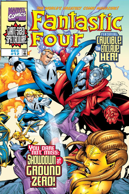
So many fonts!
So many colours!
So many logos!
I'm sure, from a design perspective, that these are "bad", but there's something about the insane throw-everything-at-the-wall energy that I love. It's too colourful, too disorganised, too messy, but it's also wonderful. It feels like the visual equivalent of pick'n'mix.

Soon after, Marvel moved to a dreadful and dull "pin up" style, with no text, and generic images that had little or nothing to do with the contents. There was much lamentation, and darkness came upon the world, etc.
I don't think any of the next wave of my books will have covers like these, but maybe one day...
I definitely like all the action and characters on the covers, but yeah, that is way too many words and fonts.
ReplyDeleteYou should definitely try to get a picture of the X-Men as the cover of your books. Even if the book has nothing to do with X-Men. Especially if it doesn't. Claim it's meta-commentary on how corporate IP is taking over everything.
If I can think of a good idea, and the lawyers let us get away with it, I'll do it!
Delete